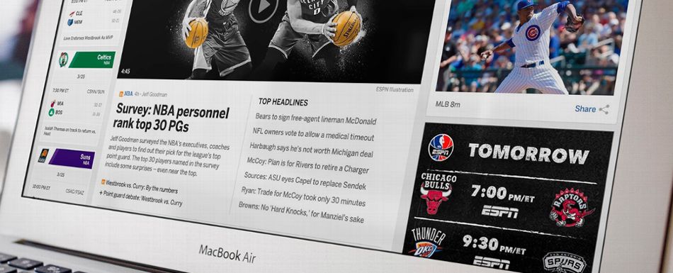
Everybody hates web site redesigns. Or so it seems, based on my three decades of doing them. I was involved with only one high-profile redesign that people seemed to love across the board. That was for a Hollywood trade paper, about 2002. Rave reviews. Rightly so -- it was a major upgrade -- but so were the others before that and the others after that. People hate change when it's inflicted upon their daily routine, and resent having to do the mental work to adapt to a new scheme. They'd … [Read more...]
Responding to responsive
Are you mobile responsive? Er, mobile friendly? Mobile ready, even? Google wants to make sure you know. Check out this mobile web site analyzer. Enter your domain name; view the verdict. Mobile-responsive web design has been with us for a while. No mere trend. I started building sites with the flexible-width scheme in the early summer of 2013. That code & design sea change coincided with the shift to HTML5. Mobile-responsive sites simply react to the screen size of the device being used … [Read more...]
Square peg. Round hole. Splat!
Having a great logo or custom header image can really make a web site. Branding, aesthetics, visual impact -- what's not to like? Here's what's not to like: Most graphic designers create artwork apart from the ultimate environment. In our example, the artist designs a header/logo image out of context. The graphic goes to the client, who evaluates it out of context as well. Terrific! Then the artwork lands in the lap of the web designer, who does an immediate face plant. Often as not, … [Read more...]


