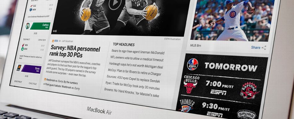
Everybody hates web site redesigns. Or so it seems, based on my three decades of doing them.
I was involved with only one high-profile redesign that people seemed to love across the board. That was for a Hollywood trade paper, about 2002. Rave reviews. Rightly so — it was a major upgrade — but so were the others before that and the others after that.
People hate change when it’s inflicted upon their daily routine, and resent having to do the mental work to adapt to a new scheme. They’d rather fight than switch.
The team at ESPN is taking lots of uppercuts right now, having unveiled a redesign on the eve of April Fool’s Day. The change was long overdue, with the site last overhauled in 2009. Plus, mobile users had tired of being forced onto a dumbed-down version of the site — despite being the majority of site readers.
The new ESPN hits all the contemporary marks — lots of white space, mobile-responsive (meaning elements scale down for small screens), giant images and better video display. “Improved personalization” is key as well, since many ESPN users are logged in to the site anyway.
ESPN’s article about the big change was featured on the site for only a day, but that was long enough to see several thousand complaints lodged via the comments. Almost all were pans. Even by redesign standards, it was a lashing. (Read all the ESPN complaints.)
“Please let this be an April Fools joke,” one early commenter said. No such luck.
I was among those who woke up April 2 hoping against hope for the “real” redesign. While I appreciate some of the changes ESPN made, I hate the thing in totality:


